

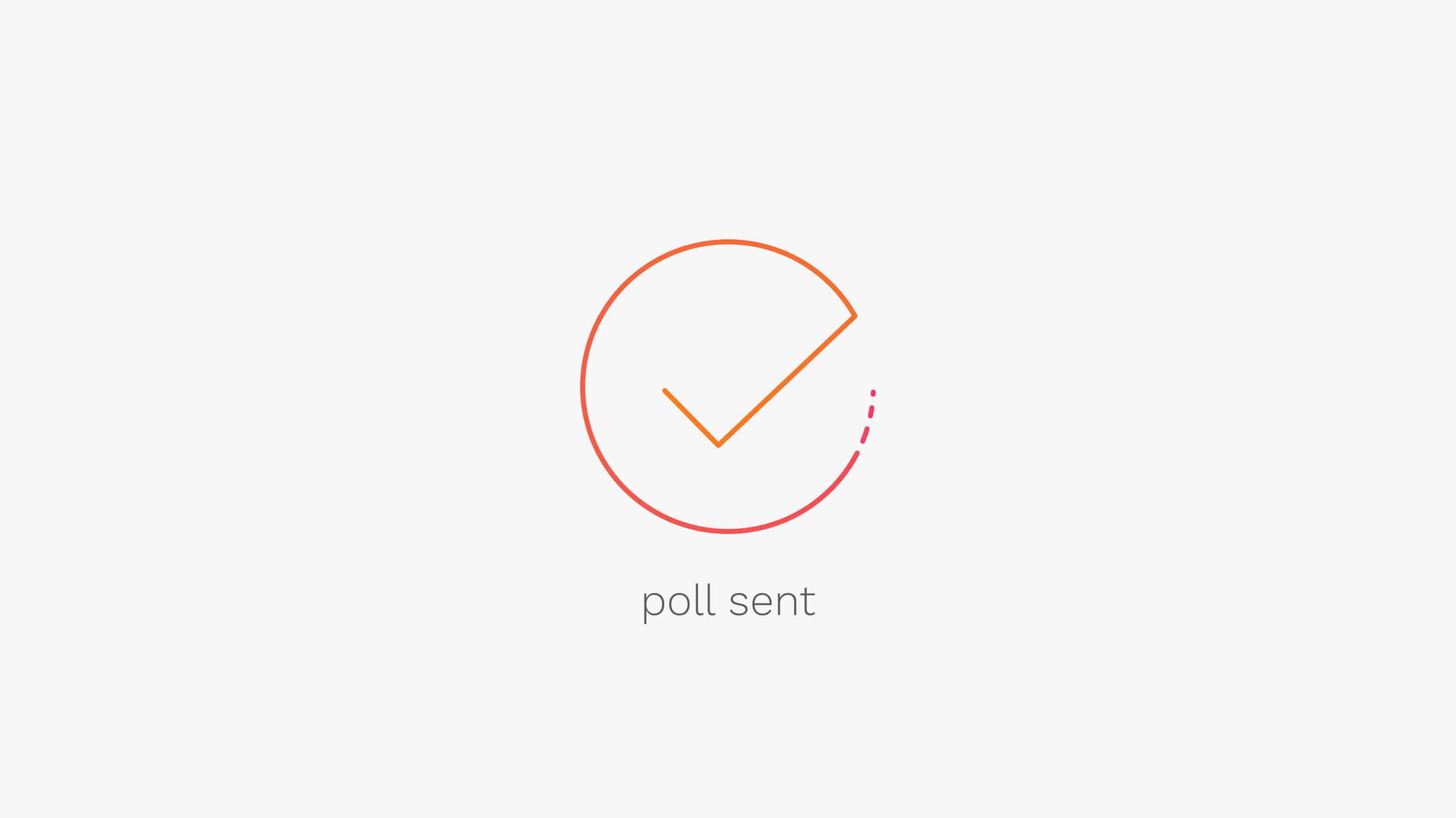
POLARIS – SCHEDULING MADE SIMPLE
Timeline 1.5 months, Feb – Mar 2017 · Role & Context Sole designer, class assignment
Everyday, in just 24 hours, we make over 35,000 decisions. Polaris was designed to make your life easier, one decision at a time. Polaris facilitates scheduling through an efficient interface that breaks the meeting scheduling process into 6 steps.
Problem Statement
I spent a couple of hours exploring existing solutions that aim to make scheduling meetings easier, namely Doodle and When2meet, in order to decipher what aspects of their respective services worked and what I felt I could improve on.
First, let’s cover the aspects of each platform that I liked:
When2meet's Home Page
When2meet
The calendar view allows you to click and drag to quickly select a group of dates.
The homepage allows you to create an event immediately, without signing up/in.
When2meet’s 2-step process makes it very quick to create polls.
Doodle's Advanced Poll Settings
Doodle
Doodle allows for more granular control of the time ranges within each date range.
You can choose to create a “basic poll” or you can customise the poll with more advanced features, including hiding participants' responses from one another, and allowing them to input how free they would be in each time slot.
Next, let’s explore some of the mechanics and decisions that I felt could be improved.
When2meet's Date Selector
When2meet
When clicking and dragging a date range, the selection would form a quadrilateral on the calendar grid rather than following the order of the dates. For example, if I wanted to select the dates from April 20th, 2017 to April 24th, 2017, I wouldn’t be able to click and drag from one date to another, as this would actually select the date ranges of April 17th-20th and April 24th-27th.
While I appreciate the simplicity of When2meet, I find it restricting that I can only choose one time range for all of my dates. If I’m free from 9am-2pm on Sunday and then 6pm-10pm on Monday, I’d have no choice but to select the time range of 9am-10pm for both days. This means that the poll that is sent out to participants will ask them if they’re available from 2pm to 10pm on Sunday, for example, even though no time in the range would work with my schedule.
There are no options to add additional details to the event, such as a location or a description. I find that, when I’m scheduling events, I need to keep the location in mind as I have to take travel time into account, so the lack of additional details in When2meet polls makes it more difficult for me to accurately respond to them.
The lack of a meeting duration selection means that participants could mark themselves as being free for a 30 or 45 minute period even if the event I’m planning is going to last for an hour.
Doodle's Time Period Input
Doodle
While you can create a custom time range for each date range, that time range is limited to a single period. For example, I can set the time range to be 2pm-10pm, but I can’t set two time ranges for 2pm-4pm and 6pm-10pm in order to account for plans I have in the middle of the day.
The lack of a meeting duration selection means that participants could mark themselves as being free for a 30 or 45 minute period even if the event I’m planning is going to last for an hour.
With these improvements in mind, here’s the problem statement I kept in mind for the duration of this project:

Target Audience
While there are many services that aim to make scheduling meetings easier, Doodle and When2meet are two of the most popular. This is likely due to their simplicity and their (lack of) price. Polaris is intended to be a free tool, so it targets the same audience as those existing options. Polaris is intended to be used by people of all ages, whether it’s high school students making weekend plans, college students making spring break plans, or business professionals setting up meetings.
My Creative Process
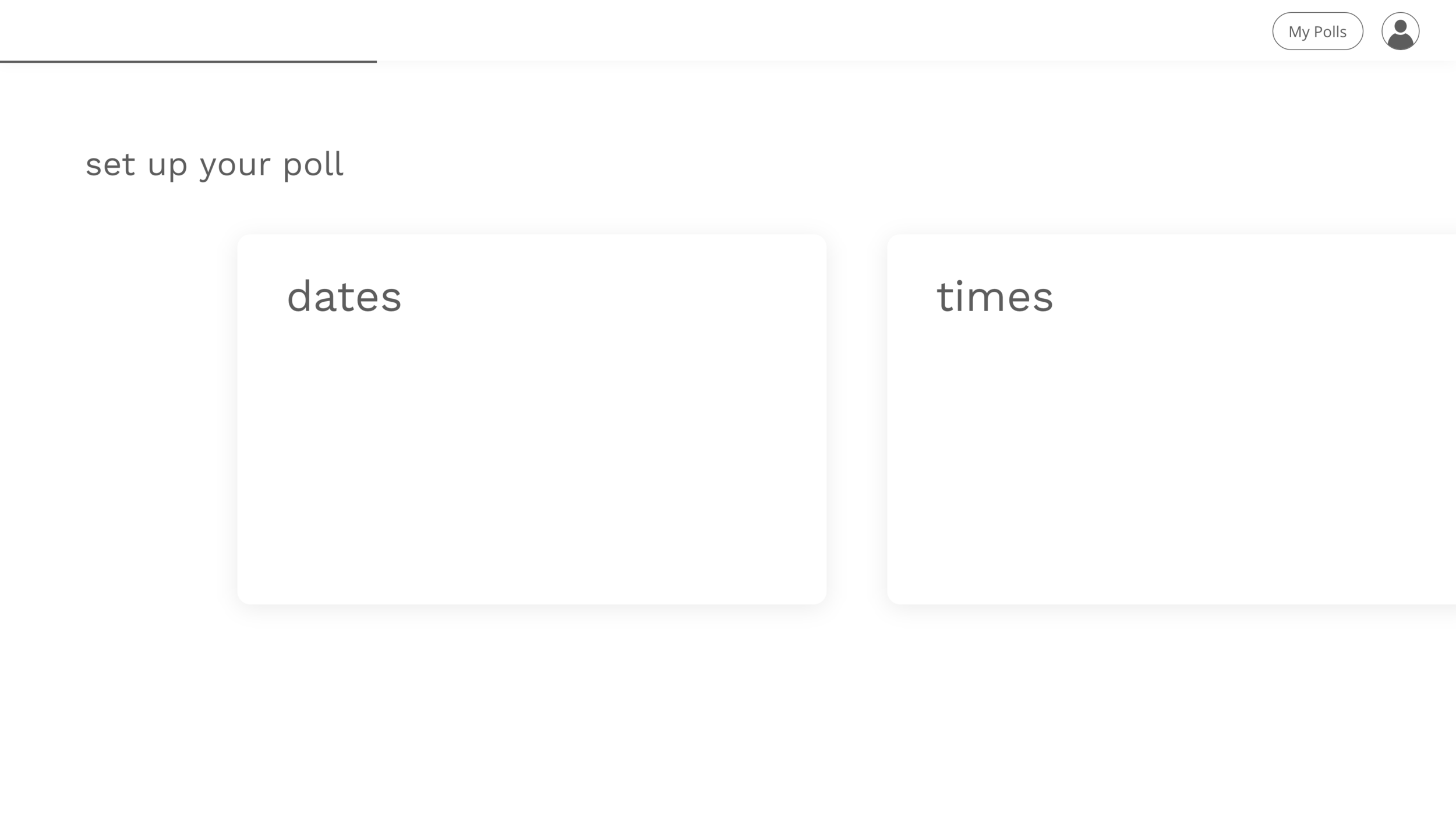
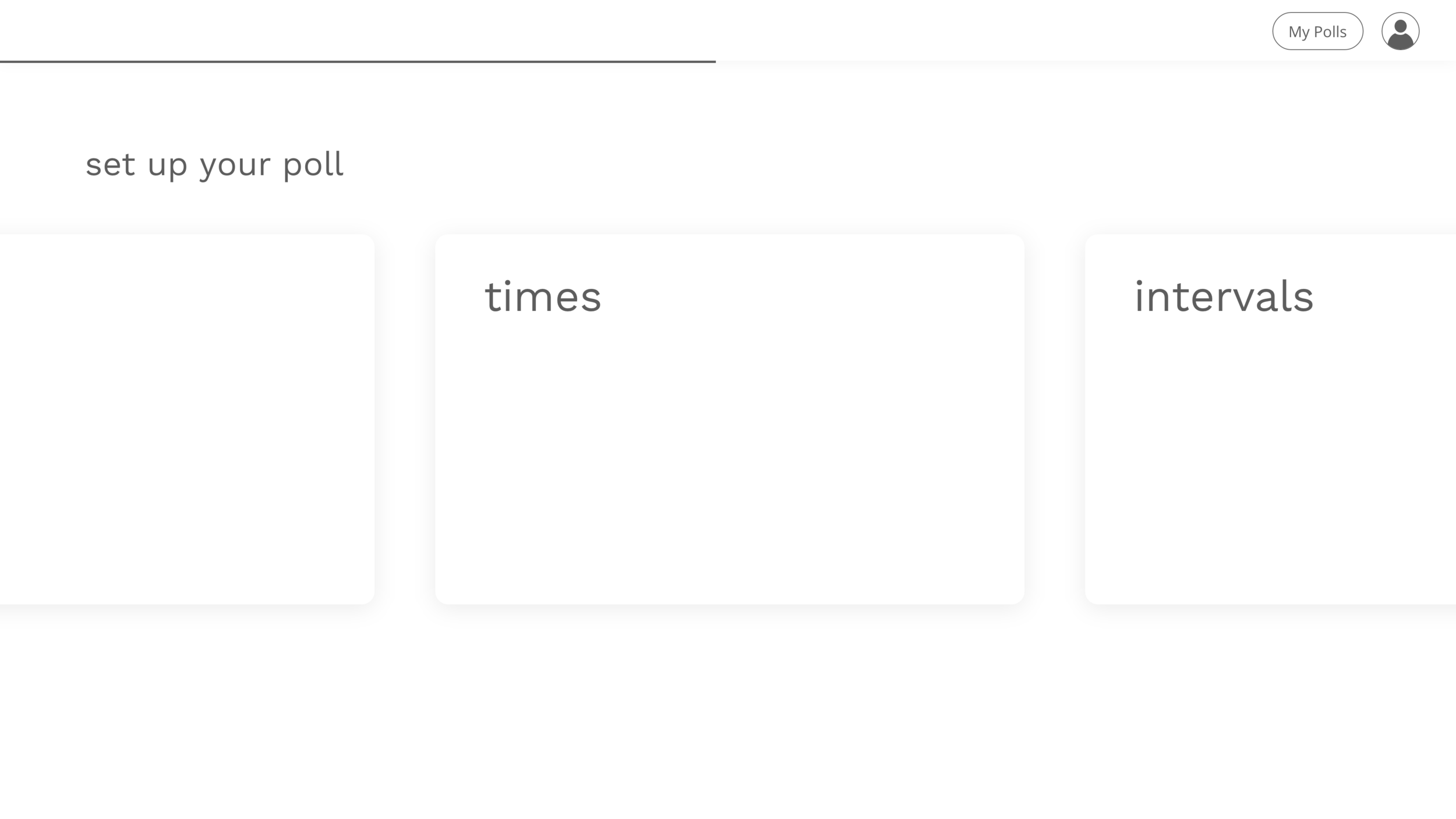
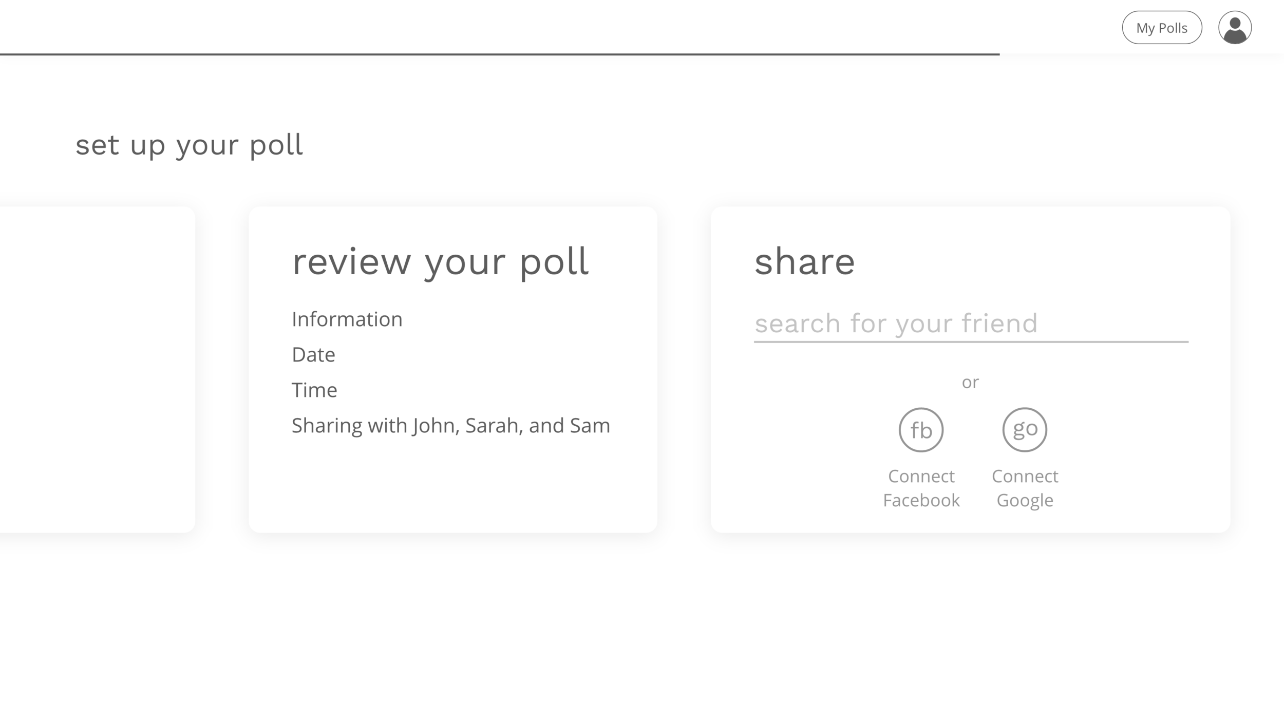
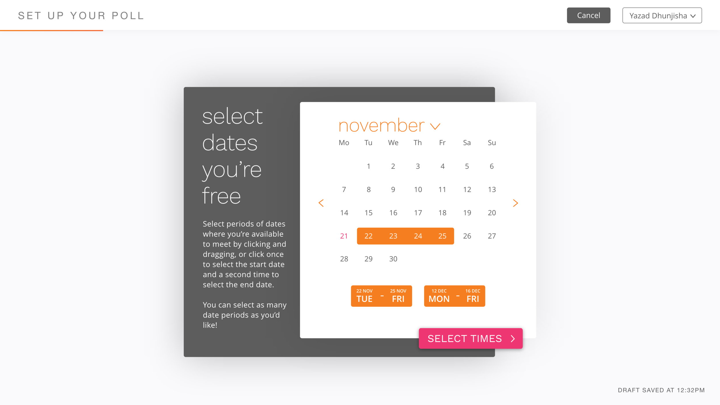
I started developing my solution on paper, sketching out any ideas I had for interfaces that could solve my problem statement. I settled on a card UI, which can be seen in the wireframes below, as I felt cards worked well to separate polls from one another on the home screen, and to separate individual tasks in the poll creation process.
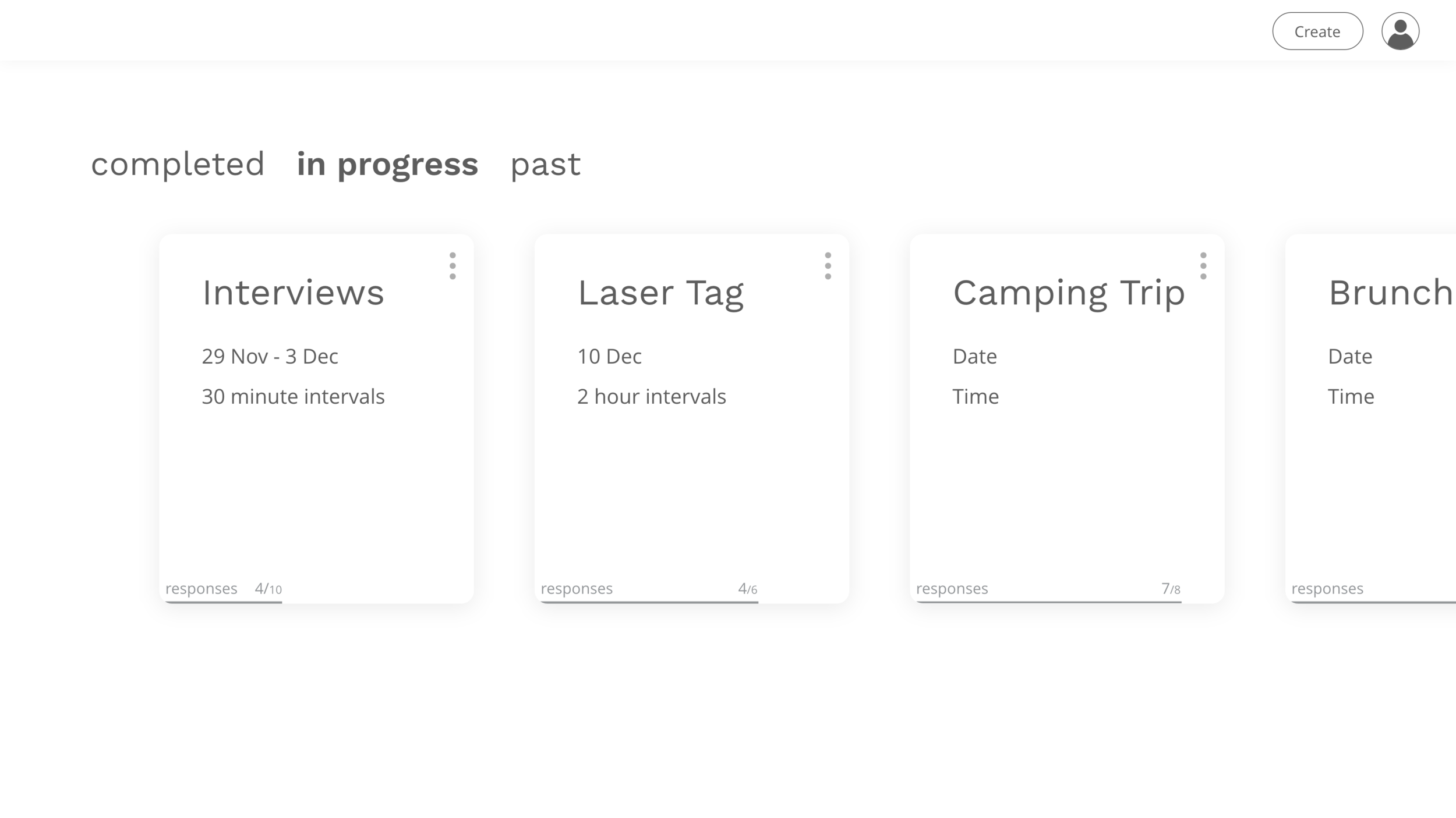
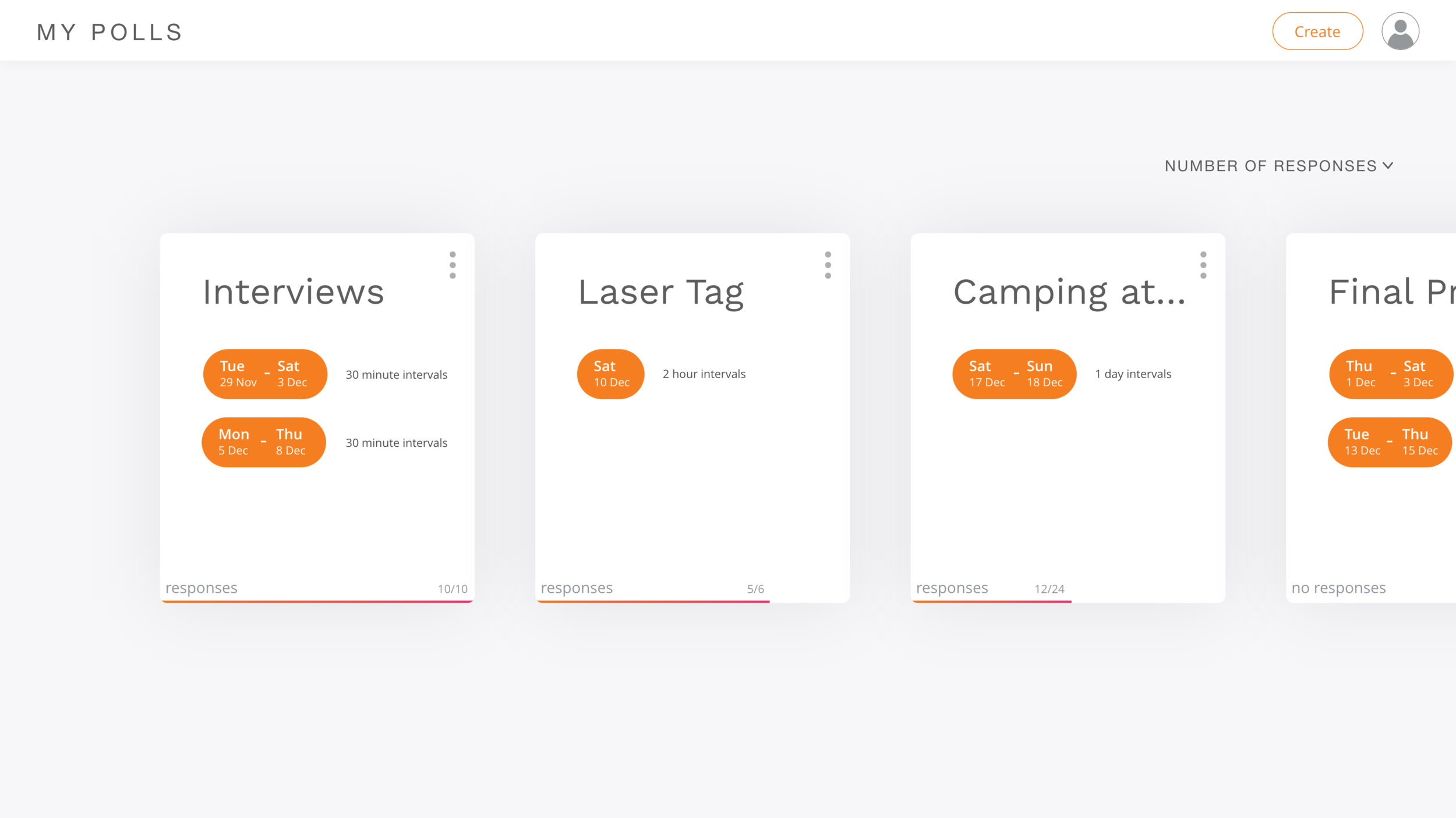
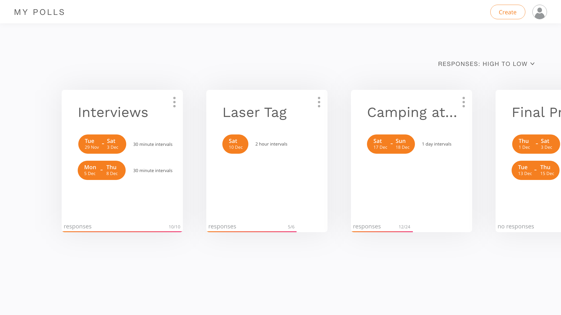
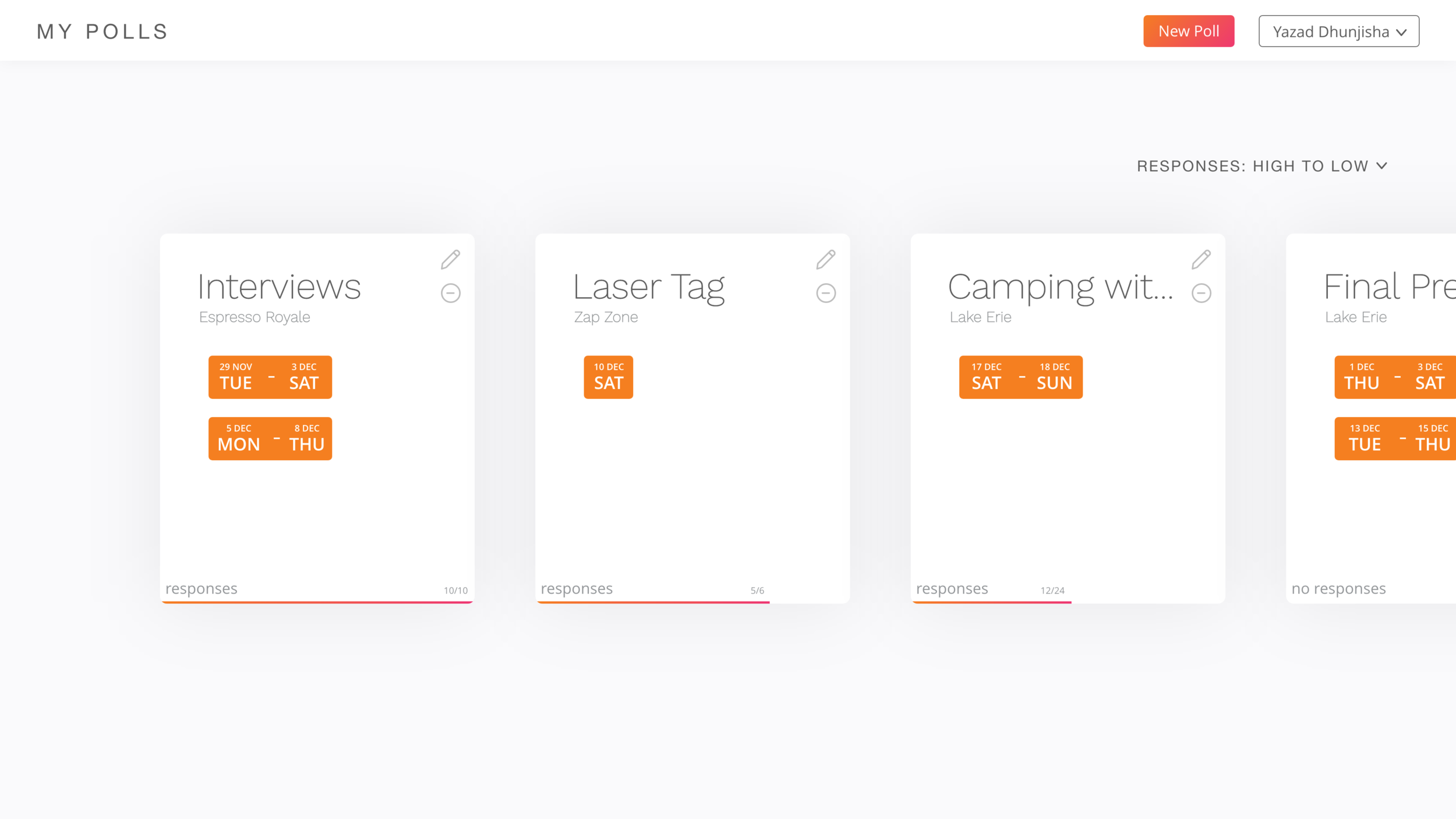
The wireframes feature these cards in side-scrolling layouts, both for the home screen and the poll creation screen. The cards on the home screen are categorised under three tabs, completed (polls which have responses from all the participants), in progress (polls that are still gathering responses), and past (polls which have an event date in the past, regardless of the number of responses from participants).
The next version of my design was the first HiFi screens. The most notable changes from the wireframes are that the poll creation screen now scrolls vertically and the tabs on the home screen have been replaced with a sorting option. The first change was made in order to further differentiate the poll creation screen from the home screen, and to avoid any usability issues given that the calendar layout scrolls horizontally. The second was made as I didn't expect my intended audience to have enough polls open at one time to warrant the three separate tabs.
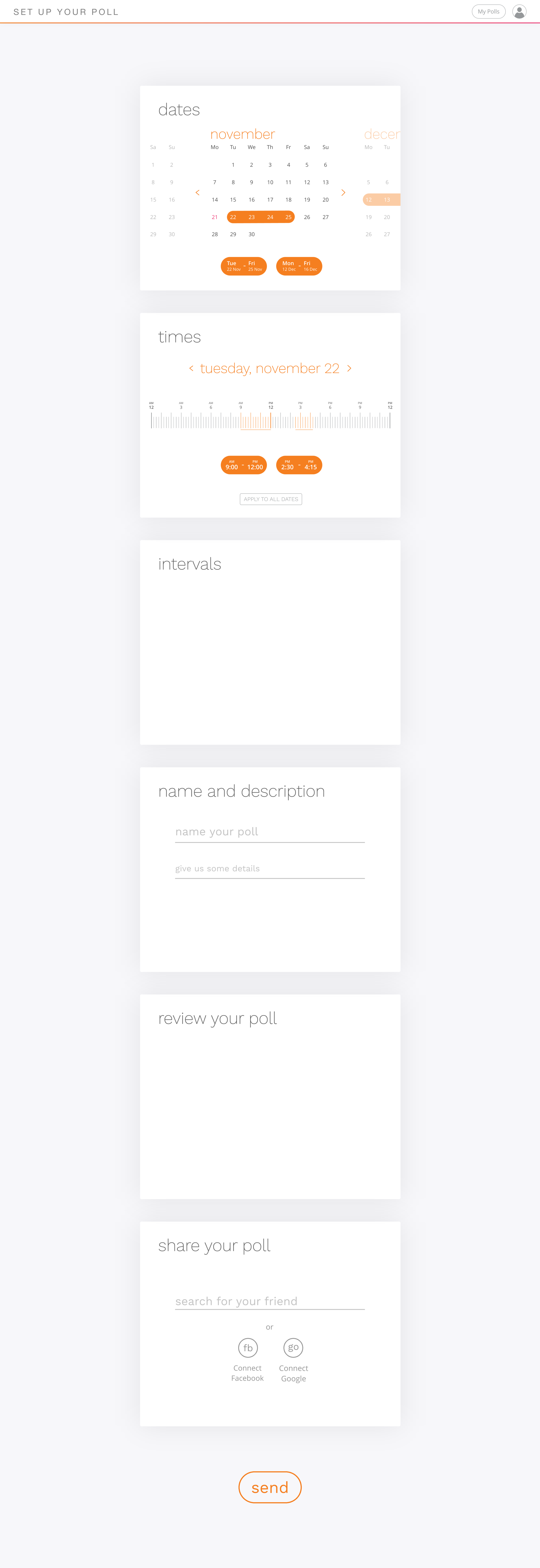
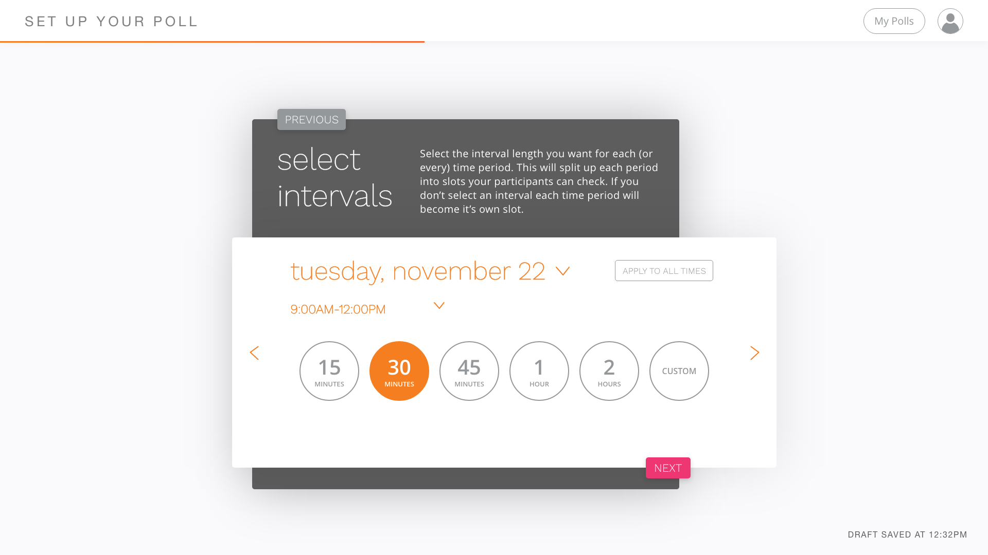
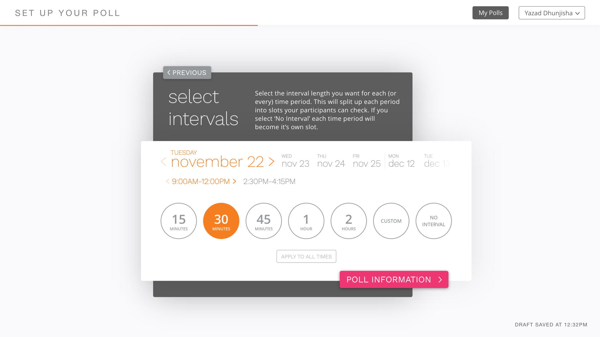
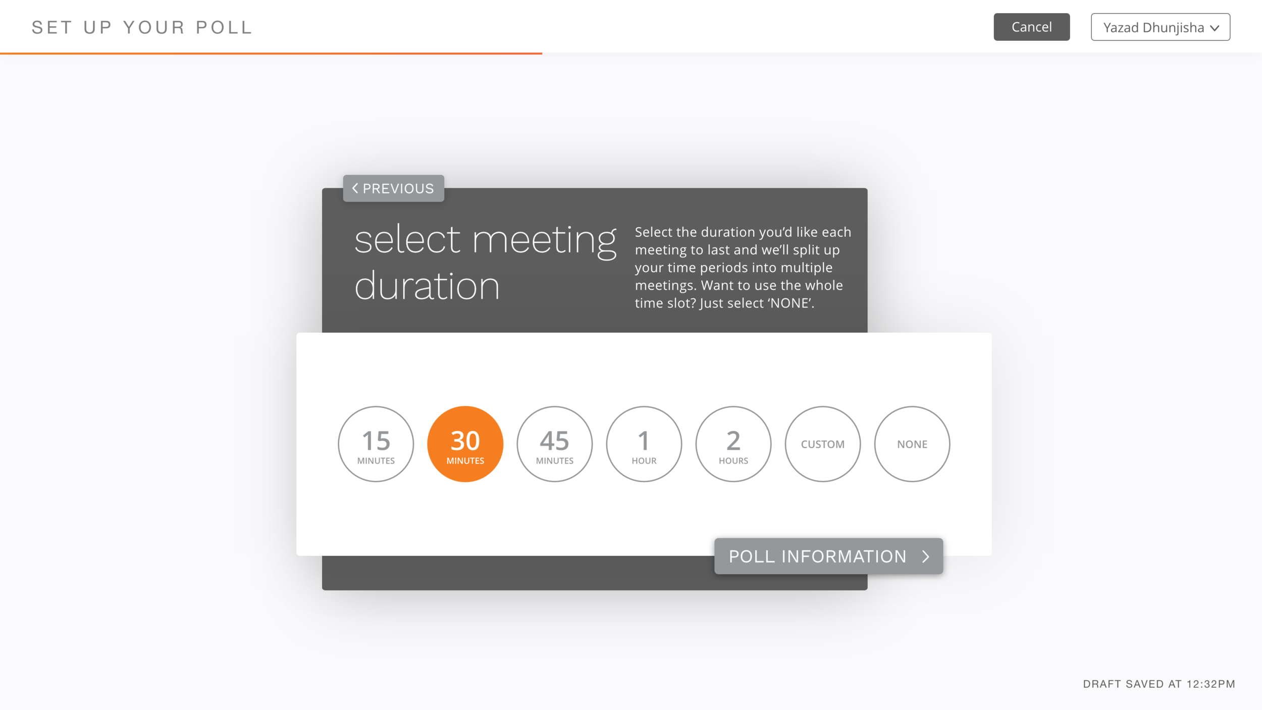
The second HiFi prototype brings the biggest visual change so far. The single card layout has been replaced with layered cards and buttons to go to the next step (the cards no longer scroll, but continue to animate vertically). The single word titles have been replaced with more instructional versions. These changes allow each card to be accompanied by help text to aid the user in creating their poll. This version also further fleshes out the meeting duration step (which was called ‘select intervals’ at this point in the development process).
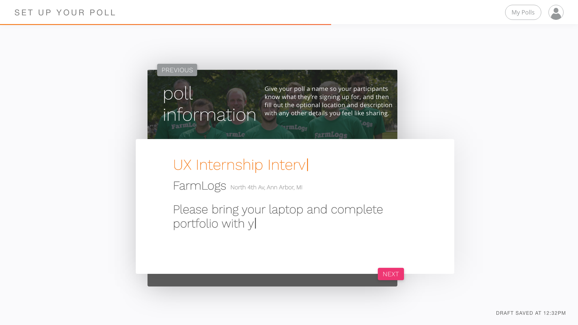
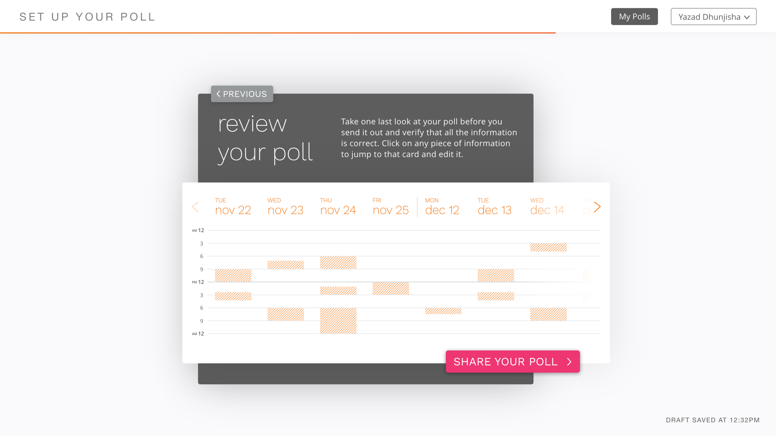
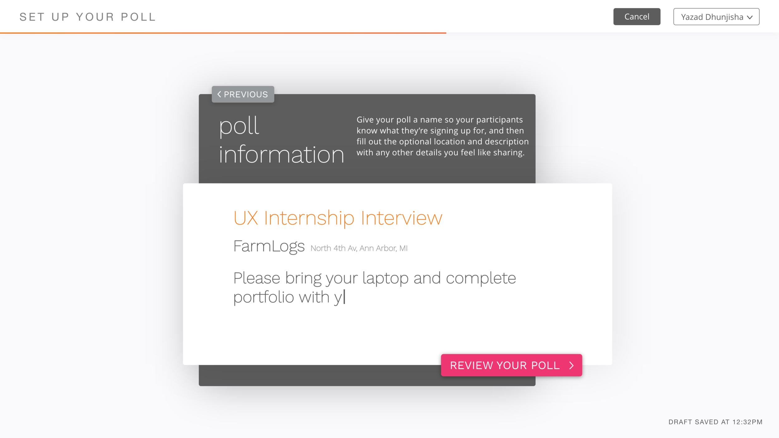
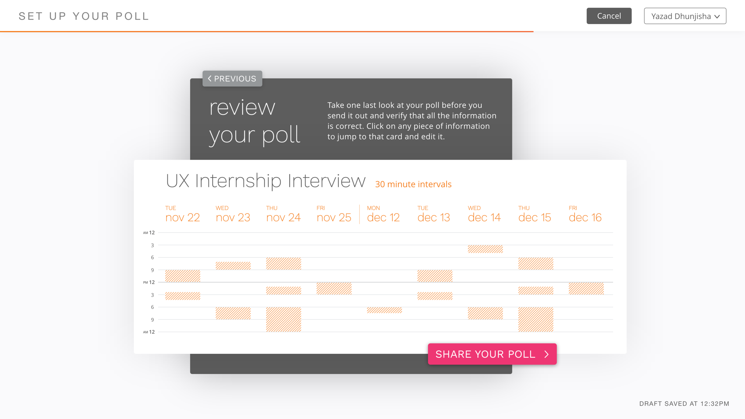
In the next stage of the design process I decided to square-off some of the rounded edges in the previous iteration as I felt that the juxtaposition between the fully and slightly rounded corners in the design harmed usability and confused some users on what was and wasn’t a button. In this stage, I also created the ‘review your poll’ card.


My FINAL Solution
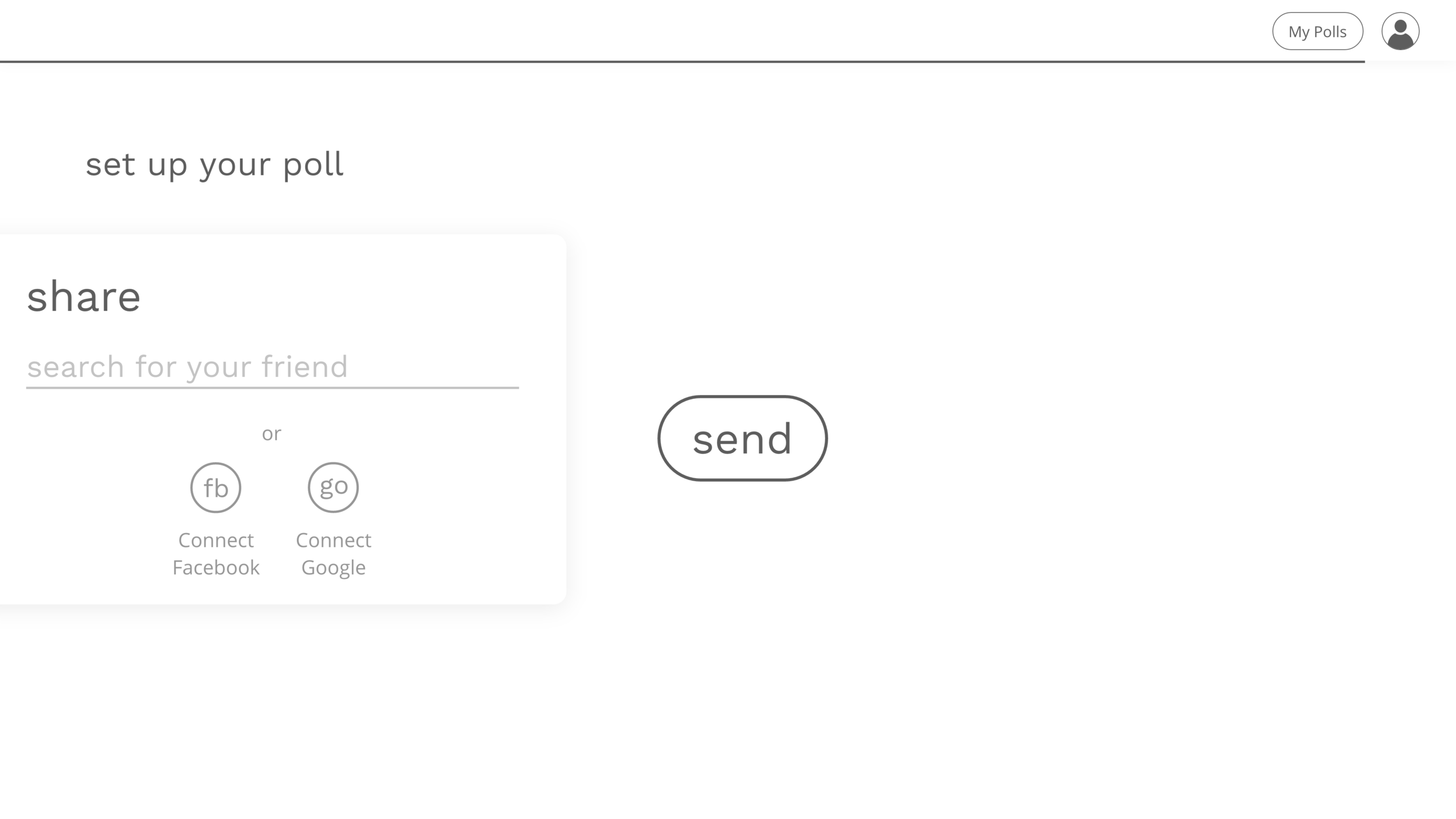
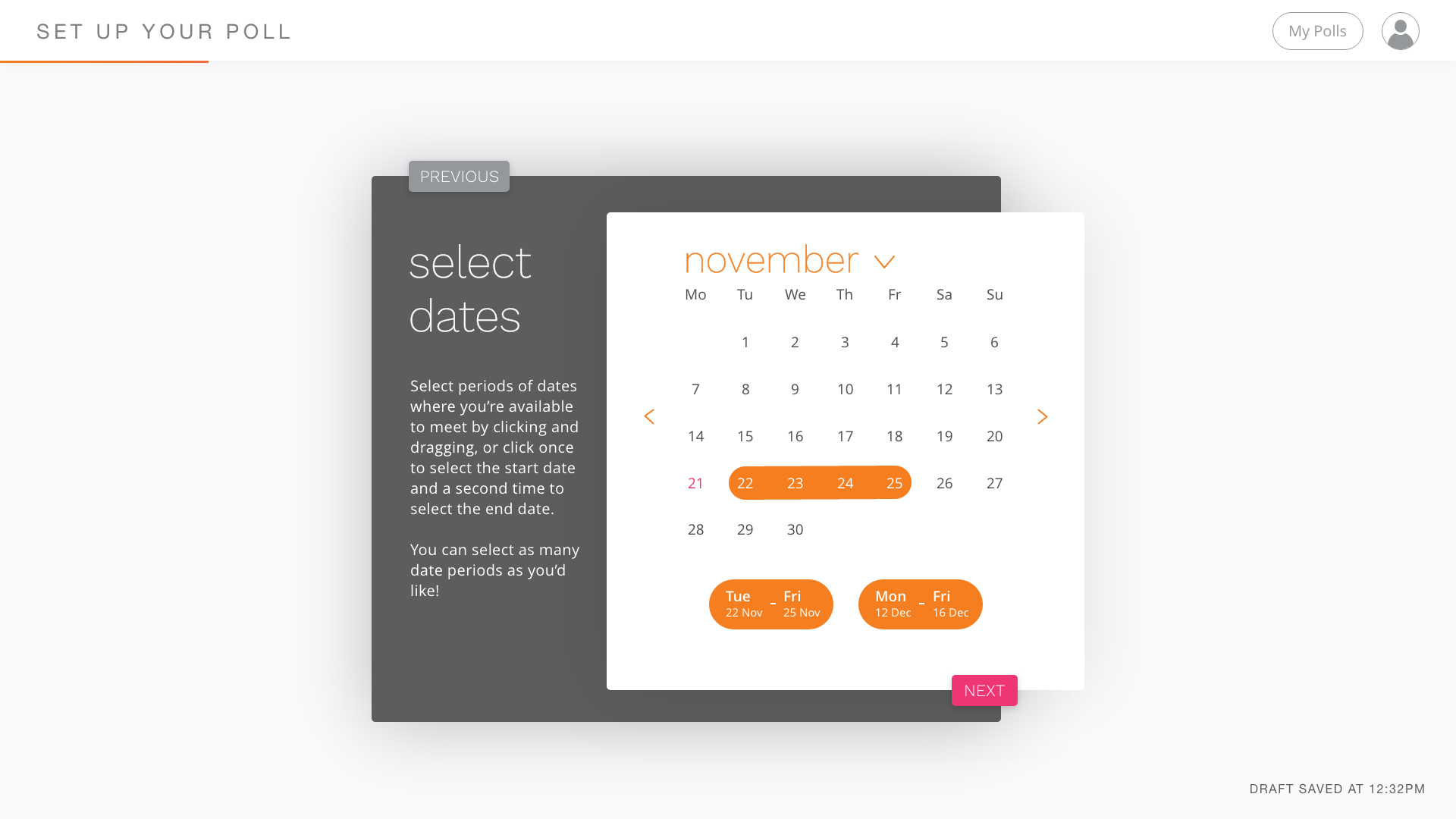
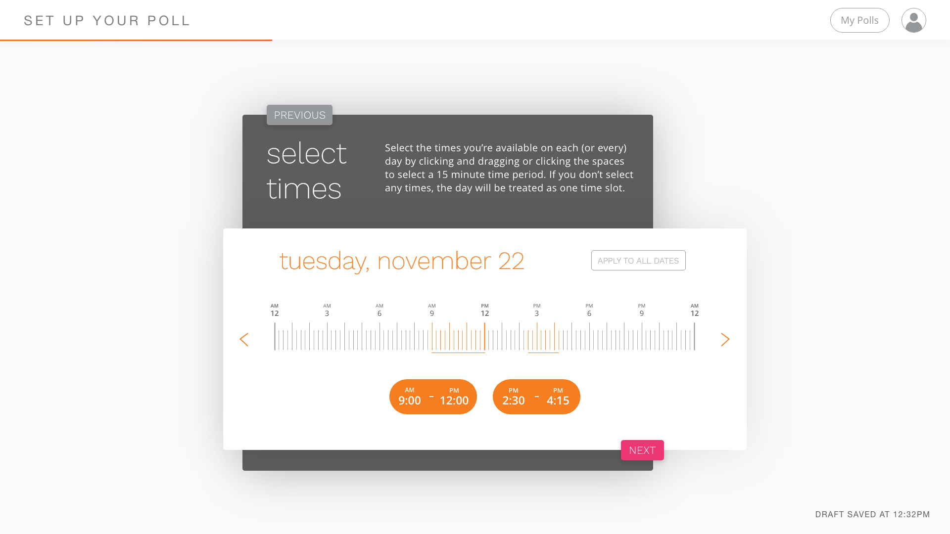
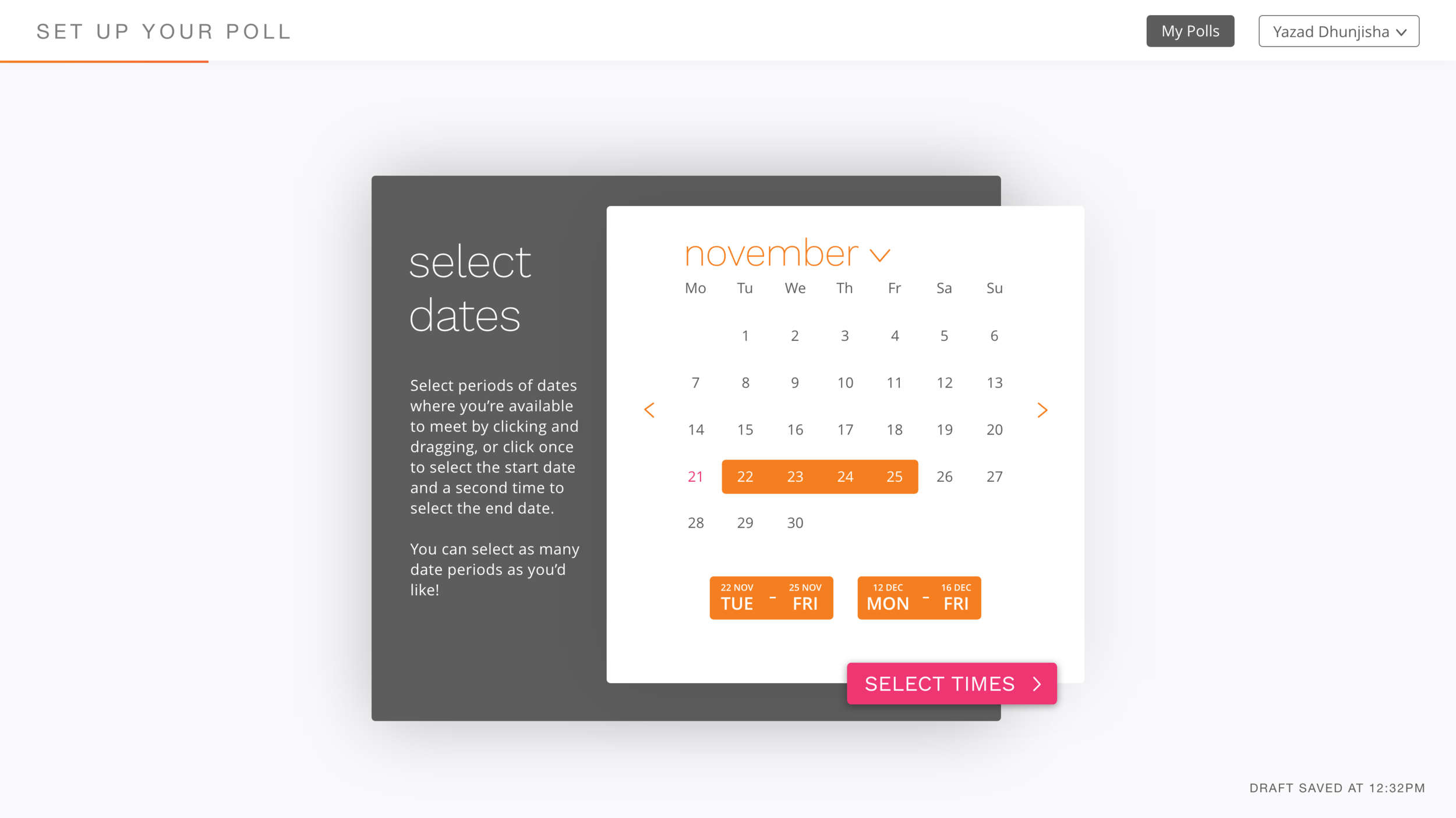
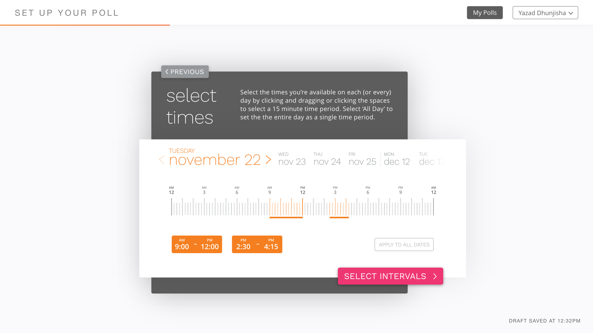
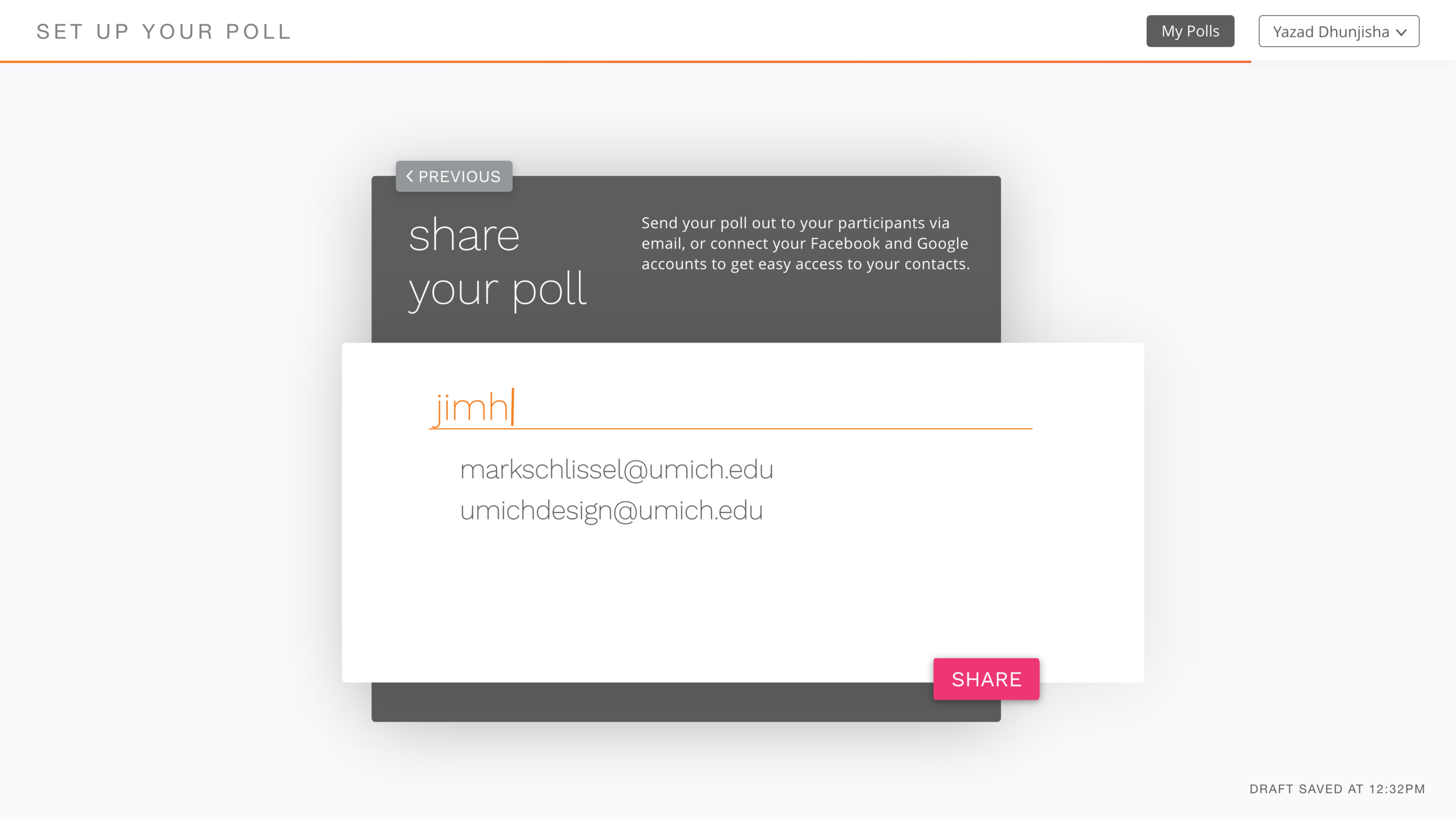
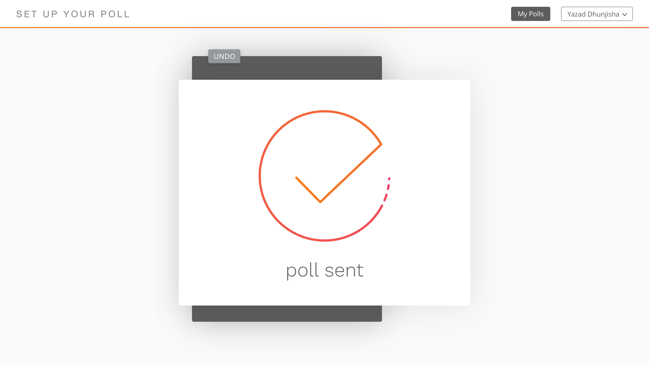
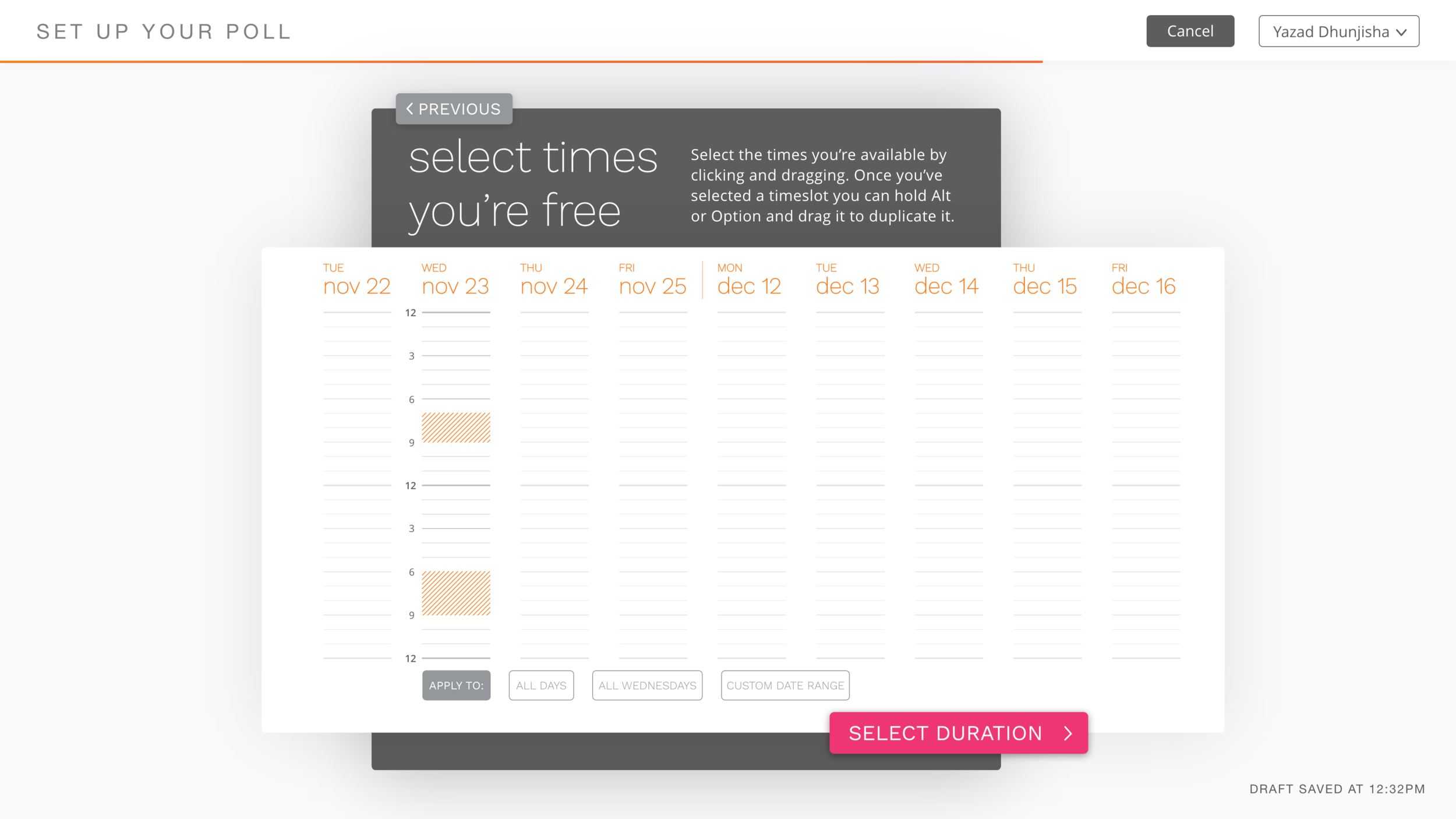
In the final iteration of the HiFi prototype, I redesigned the time selection process based on feedback from my previous prototypes and the realisation that my previous solution didn’t completely solve my problem statement. The time selection card now allows users to more easily select times across their entire date range, minimising the number of clicks required to work your way through the range. It also now allows the users to have their time selection duplicated across other dates in their date range.
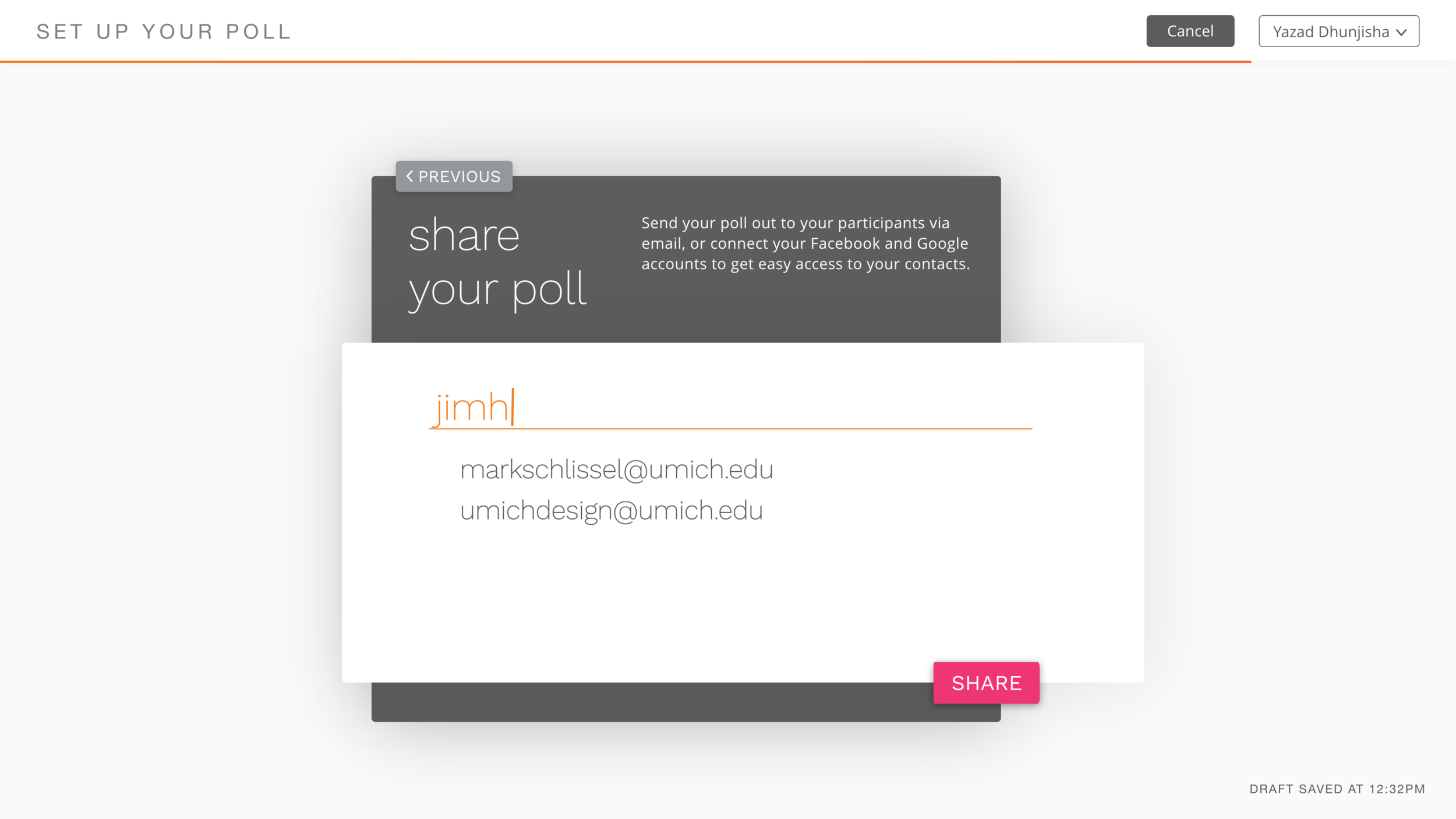
As per my problem statement, I want my solution to allow people “to easily and quickly find a meeting time that works for everyone”. As such, my main priority was creating a useable interface that made it quick to create polls with multiple dates and time periods. I feel like the changes I made during the development of my HiFi process exemplify this, and contribute greatly to making the app more useful to potential users.
My solution allows users to click and drag to select a date range that conforms to the order of the calendar dates, as well as select multiple time periods in each day. Each poll has inputs for a location and a description, as well as an option to set a meeting duration. Consequently, I believe my solutions fixes all of the issues I had with existing solutions like Doodle and When2meet.
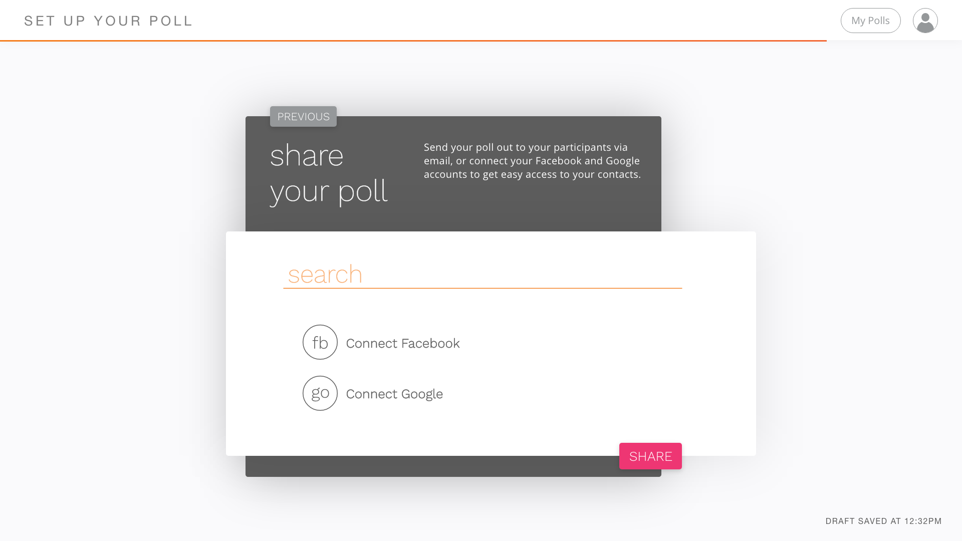
As this was a class project, I got feedback through the duration of the project from my professor and TAs. The second-to-last iteration of the HiFi prototype was noted as being mostly usable and beautiful, but with usability issues on the time and meeting duration pages, which slowed down the user flow. The feedback I got on the final iteration was that the time and meeting duration pages were much improved, and that the graders particularly liked the hover states on some of the pages that displayed additional information.
My next steps involve designing the user flow from the perspective of users who receive an invitation to participate in a poll, rather than create one. I’d also like to expand on some of the customisability options of the poll, much like Doodle’s advanced poll options. Finally, I want to continue exploring ways to improve the usability of the time selection, by integrating drag and drop commands to duplicate time periods and possibly giving users the option for finer control of the time periods, as they currently snap to 15-minute intervals.